i2 Tips & Tricks: Accessible exchange of information using legends in Analyst’s Notebook
Suppose you are working on an investigation with multiple colleagues, regularly exchanging information. You are provided with the most elaborate charts, filled with colours and lines. Occasionally, you may wonder about the significance of the colours and lines in the chart. In such situations, a small legend can make all the difference. This article explains how you and your colleagues can add legends to charts in Analyst’s Notebook.
Stepwise explanation
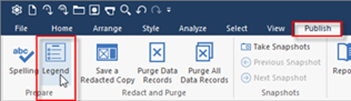
Create a legend in Analyst’s Notebook by clicking the “Legend” button found under the “Publish” tab.
This pulls up a screen asking whether all item types found in the chart should be put in the legend (the term used is: “populated”). We definitely recommend against this, particularly for larger charts. Selecting this option will cause the program to place all items and link types in the legend, resulting in an overly full and inaccessible overview.
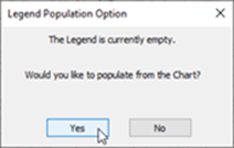
Selecting “No” takes you to a follow-up screen. Click the “Populate” button to indicate which elements to include in the legend.
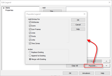
The “Action” field lets you indicate what should happen when you press the “OK” button.
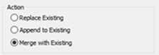
|
Replace Existing |
Replace all items found in the legend with the current chart values. This will first remove all existing items. |
|
Append to Existing |
Add all existing items to the legend, even those already included in the legend. This means that existing items may end up in the legend more than once. |
|
Merge with Existing |
Adds all selected items to the legend if they were not yet featured. Those items already in the legend remain unchanged, even if the item type is no longer in the chart. |
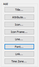
In addition to using the “Populate” button, it is also possible to add elements to the legend by clicking one of the buttons in the centre of the screen. For example, the “Font…” button can be used to assign a meaning to a particular font.
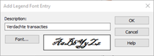
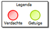
After selecting the desired elements, you can assign a specific meaning to certain fonts, line colours, and shapes. You can also assign meaning to the colour of the frame around an item, as shown in the example below. The Descriptions associated with the items can be adjusted under the “Edit” button.
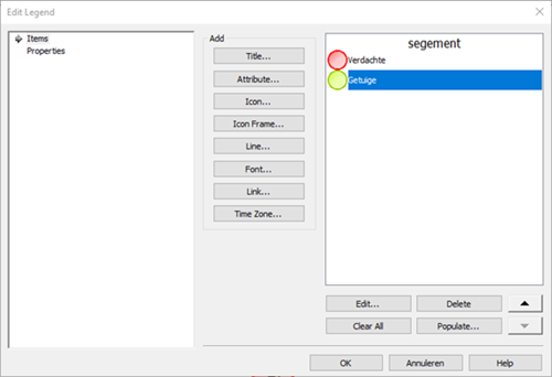
Legend location
On the left side of the screen, you will find the “Properties” option, which lets you indicate where the legend should be positioned. Should you have difficulty locating this option in the chart after the legend has been created, simply click the legend button and select “Left” and “Top”. This will position the legend at top left. Select “Free” to freely drag the legend across the chart.

In short, the relatively simple addition of a legend in Analyst’s Notebook lets you and your colleagues more efficiently exchange information and prevents incorrect schedule interpretations.
Want to know more about the functionalities in Analyst’s Notebook? Take our Analyst’s Notebook training or contact us.